Saturday, August 31, 2013

What I Did At My Summer Intensive, featuring the OPI NYCB Collection

It's been a while since my last post; for some people August means going back to school or college, but for me it means summer intensive.  Every year I attend the August session of Sun King Dance Camps, a weeklong ballet camp structured for adult dancers from beginners to advanced; this year was my fourth.  We spend about six to eight hours a day dancing, learning everything from ballet to jazz to techniques for improving turnout, and there's a performance at the end where we dance on an actual stage in a theatre - for some of us, this is the first or only chance we get to perform.  It's a lot of fun, with a great group of supportive and friendly people, and I look forward to it every year.

Not long before intensive, I went a little crazy and purchased the entire spring 2012 OPI New York City Ballet SoftShades Collection because, well, ballet.  But instead of just modeling it on myself at home, I decided to take it with me, because how better to show it off than in an actual ballet studio on actual ballet dancers?

The collection, left to right: My Pointe Exactly, You Calling Me A Lyre?, Care To Danse?, Don't Touch My Tutu!, Barre My Soul (ugh, OPI, no), and Pirouette My Whistle.

Because it was hard to coordinate with my models, we decided to model two colors at a time, one on each hand.  My first model was Kristina Showalter-Grant, who in real life runs the Harrisburg Ballet Theater and is also disgracefully flexible, as you'll see at the end of this post.  ;-)  First up, Kristina shows off My Pointe Exactly and Don't Touch My Tutu!

Don't Touch My Tutu! (top) is a sheer white polish, while My Pointe Exactly (bottom) is a slate gray.  Shown is three coats, no top coat.  All of the NYCB polishes have the same translucent "sorbet" finish", which isn't quite as see-through as a regular sheer polish or as squishy as a jelly. None of these have shimmer (except for Pirouette My Whistle, obviously).

It's hard to see (the lighting was not the best in the studio hallway and all I had was my phone camera), but this is Don't Touch My Tutu! and My Pointe Exactly with a coat of Pirouette My Whistle, the "fantasy" topcoat for this collection.  Pirouette My Whistle has silver microglitter and larger pearl-white circles in a clear base; it's a nice way to add sparkle without going for in-your-face bling the way some glitter toppers do.

Up next are You Calling Me A Lyre? (OPI, we really need to talk about these goofy names) and Care To Danse?

Care to Danse? (left) is a milky grayish lavender that tends to pull more pink than blue.  You Calling Me A Lyre? is a delicate whitish-pink - this is what we tend to think of as a traditional "ballet pink", the color of tights and new ballet slippers.  Again, three coats with no topcoat, but notice how glossy they are anyway.

And here's Care To Danse? and You Calling Me A Lyre? with Pirouette My Whistle.  Under fluorescent lights this gives off a beautiful, dainty sparkle.

And finally, Barre My Soul and Pirouette My Whistle (by its own lovely self):

Barre My Soul is a milky peach; it's very, VERY similar to You Calling Me A Lyre?, but leans just a bit more yellow.  Honestly, I'm not really sure anyone needs both of these because they are so similar; if you have a cool-toned complexion, You Calling Me A Lyre? would probably be best, while those with warmer undertones to their skin would do better with Barre My Soul.  Pirouette My Whistle looks just as great on its own as it does as a topper when all you want is a little hint of glitz.

Here's Barre My Soul topped with Pirouette My Whistle:


My second model was Jasmine Flanagan; in her other life, Jasmine is a veterinarian!  That's one of the truly fascinating things about these camps, seeing everyone from doctors to engineers to priests (yes, you read that right) to homemakers to lawyers in the same place, all united by their passion for dance.  Unfortunately I didn't have a whole lot of time to work with Jasmine - between classes, basically - so she only modeled two colors for me.  Jasmine chose My Pointe Exactly and Barre My Soul:

We both thought My Pointe Exactly would be more flattering on Jasmine, but to our surprise Barre My Soul came out the winner because of its warmer base.  You can also see just how sheer these polishes are; even after three coats there's visible nail line.

And with Pirouette My Whistle:

The colors in the NYCB Collection are nice, delicate colors, very appropriate for the office (or the studio!) or any time you just want a clean, neutral look that isn't your typical barely-there pink or I-have-to-have-something-on-my-nails clear polish.  They're also difficult to find; I had to collect mine piecemeal, but they can still be found at sites like Amazon, eBay, and drugstore.com.

Thanks to my lovely models, who graciously took time out from a busy day of dancing to let me do their nails and pose them.

Kristina (she can also do that without the stretcher contraption):


and Jasmine:


And as a bonus, this is me on the last day of camp in my new purple leotard (gotta love the group dancewear store trip), tiara, and a borrowed tutu.  Note: taking selfies on pointe is hard.  Don't try this at home.


Until next time!

Saturday, August 10, 2013

L'Oreal Miss Candy jellies (Summer 2013) and bonus jelly sandwich!

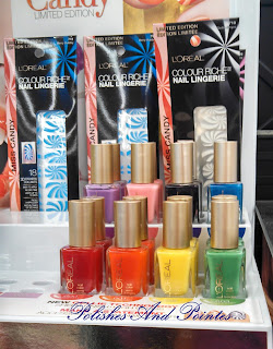
I've mentioned the L'Oreal Miss Candy line in an earlier post, but I figured I'd give you all a better look at it.  This is L'Oreal's Summer 2013 collection, a line that also includes lip gloss and "nail lingerie" nail stickers.  The full collection has eight "jelly" polishes - here's the display at a local Walgreens:


Back row, left to right: Lilac Coolers (lilac purple), Bubble Trouble (pale bubblegum pink), Berry Nice (deep purple), Miss Pixie (royal blue).  Front row: Jolly Lolly (cherry red), Mango Mamma (bright orange), Bananarama Love (yellow), Creme de Mint (medium green).  You can also see the Nail Lingerie stickers in the back.  I was pretty surprised to see a display this full - most stores are down to a handful of things from this collection. 

I chose five colors from the Miss Candy line; I don't really wear yellows and oranges and the green didn't appeal to me.  Here are my five favorites:


Left to right: Berry Nice, MissPixie, Jolly Lolly, Lilac Coolers, Bubble Trouble.
Because there are five of them, I decided to swatch these as a skittles manicure.  Here they are at one coat:

 
Thumb to pinkie: Miss Pixie, Berry Nice, Jolly Lolly, Lilac Coolers, Bubble Trouble

Jellies are translucent polishes with a shiny, "squishy" finish.  You can see how sheer they are in the pic above - the last two are almost invisible.  I did notice some patchiness and streaking, especially if I had to go over an area again.

Two coats (pardon the mess around the cuticles):

Still some patchiness with Berry Nice and Miss Pixie, but look at the depth of color in Jolly Lolly!

Three coats:

Berry Nice is still disappointingly patchy, and I'm not happy about the way Miss Pixie seemed to fade away at the tips.  Lilac Coolers and Bubble Trouble came out nicely; these two have a milkier, less translucent finish than the others.  My hands-down favorite from this collection, though, is Jolly Lolly - look at that gorgeous squishy red!  I've worn it before, and in the sunlight it looks like a cherry jellybean.  It also seems to be a shade more opaque than its deeper sisters, with less VNL showing than the other dark shades - over a white base the VNL is eliminated and you still get that beautiful cherry-red color.

Because jellies are so sheer, they're perfect for "jelly sandwich" manicures.  I chose to pair Bubble Trouble with OPI's Polka.com.  Polka.com is from the 2013 Euro Centrale collection and has fuchsia, turquoise, and dark blue round glitters with dark blue microglitter in a clear base.


Jelly sandwiches are another ridiculously simple nail art technique.  It basically involves just what it says: glitter "sandwiched" between layers of jelly polish.  For mine I did two coats of Bubble Trouble, followed by one coat of Polka.com, and a final coat of Bubble Trouble with Sally Hansen Instra-Dri topcoat to finish.


This mani was so much fun, and I got a lot of compliments on it; it's a pretty and feminine look that isn't bland.  I did have to dab Polka.com on in spots and declump it in others - the larger glitters just LOVE to stick together even with polish thinner.


If you like the Miss Candy collection, run out and get it quickly - it's disappearing fast!


All polishes were purchased by me; all opinions are my own.

Saturday, August 3, 2013

Essie The Girls Are Out and Maximilian Strasse-Her

Found these two beauties in the clearance bin at Rite Aid - The Girls Are Out and Maximilian Strasse-Her, both by Essie.
Note the clearance stickers; Essie polishes usually retail for around $8, but I got these for $3.99 each! :-)
The Girls Are Out is from the Summer 2013 Naughty Nautical collection.  It's a deep fuchsia-berry with  subtle flecks of silver shimmer (say that three times fast).  This is three coats, no topcoat: 
The Girls Are Out tends toward sheer, and you can still see a hint of visible nail line even after three coats.  Application for this one was a bit patchy - I had some trouble with streaking and bald spots on the first coat, but the second coat evened them out and they were gone by the third.  The shimmer is a little more noticeable on the nail than in pictures, but not by much; I've noticed this with several Essie shimmer-fleck polishes (Madison Ave-Hue and most of the Naughty Nautical line comes to mind).  Topcoat might bring the shimmer out a little more, but it would still be mostly invisible in anything but direct sunlight.  Still, it's a pretty shade, one to wear when you want fuchsia but don't want anything too bright and crazy.  I'm still trying to figure out how the name fits into a nautical-themed collection, and the only thing I can think of is a woman going topless on a boat.  O_o

Maximilian-Strasse Her is from the Spring 2013 Madison Ave-Hue collection, and it's an...unusual shade. Shown is three coats, no topcoat:
Maximilian Strasse-Her is a play on the famous street in Munich, Germany, the western end of which is renowned for its luxury shops and hotels.  It's a dusty grayish-green creme without even a hint of shimmer.  This one was a little out of my comfort zone, but it's certainly not bad on my pale hands - I can see myself wearing it in the fall and winter when I want a shade that's a bit more conservative but still out of the ordinary.  It was actually opaque in two coats, but I put on a third to smooth out a couple of dings.  I did notice some very minor streaking, but topcoat would fix that.


All polishes were purchased by me; all opinions are my own.

Friday, August 2, 2013

Syrup manicure with L'Oreal Miss Pixie and China Glaze Fairy Dust

I mentioned Miss Pixie from the L'Oreal Summer 2013 line in my last post, but I wanted to show off the syrup manicure I did with it.  Pardon the not-so-fantastic picture; it was overcast and I was using my phone camera.

Syrup manicures are ridiculously easy; you're just applying layers of a sheer or jelly polish that gradually cover the entire nail.  (A tutorial can be found at Polish Insomniac.)  For this I used Miss Pixie from L'Oreal's Miss Candy line for Summer 2013.  Miss Pixie is a bright, sheer royal blue with a shiny jelly finish.  The formula was fairly smooth, although it did have some minor streaking.

The glitter topping is China Glaze's Fairy Dust, a holographic, very fine microglitter in a clear base.  It's optional - the mani would work just as well without it or with a clear top coat, but the glitter topper adds sparkle and blurs any mistakes.  The polish itself felt kind of goopy, but a few drops of polish thinner should help with that next time.

This was my first attempt at syrup nails, and it didn't turn out quite the way I'd envisioned - I think I made the "bands" too wide - but it's still pretty. 


Thursday, August 1, 2013

A trip to Walmart, or This Is Why We Can't Have Nice Things

I took a trip to the Walmart near my office after work today, and of course I had to go visit the nail polish aisle.  Buying polish at Walmart - at any big-box store, really - is a hit-or-miss affair; you can't always find the latest colors, people love to "test" items that are plainly not meant to be used as testers, and nobody seems to know how to put an thing back where they got it even if its place is only 12 inches away.  But sometimes you just have to do what you have to do.

Walmart recently updated their manicure section, aiming for a brighter and cleaner, more appealing look.  It didn't last very long.  This display is less than a year old, and you can see where budding graffiti artists have "tagged" the shelves with polish - I saw it as it was being installed, and two days later the taggers had struck.  Makes you wonder how many unsuspecting shoppers went home with a gooey, not-quite-full bottle of the color they chose.  Notice the many, many empty slots - I don't think I've ever seen this display completely filled.  The higher-end polishes like Essie and Nicole were fairly well stocked, but the bargain-brand ones were practically decimated.

                                    
This is an endcap for L'Oreal's Summer 2013 "Miss Candy" line, and for some bizarre reason Berry Nice and Miss Pixie are switched.  Miss Pixie is actually a royal blue jelly polish, while Berry Nice is a dark purple jelly.  And note the purple blotch between the color illustrations...another "tagger".

Here we have a three-sided Revlon display that's largely empty except for the nail art duos.  Those are fully stocked probably due to the fact that they're hidden behind another endcap display.  I saw the same thing with a display of Maybelline Color Show polishes; meanwhile the main aisle display is half-empty.  Not exactly good marketing procedures.


These two bottles were on the Essie portion of the display rack.  Take a look at the label - both are the iconic shade "Ballet Slippers".  (Fun fact: this is the only shade of nail polish Queen Elizabeth II ever wears.)  But they're not exactly the same...


One bottle is a pale pink, while the other is more of a buff color.  Maybe one was a different batch, or maybe it's just so old it's changed color over time.  But either way it's kind of off-putting.

The trip wasn't a total loss, though; I went in hoping I'd be able to find the Salon Perfect Neon Collision collection, which has been generating some buzz in the nail-blog community.  I didn't find the collection, but I did find this:


This is Kaboom - neon blue and lime-green matte glitters in a clear base.  It's a mass-market dupe of the popular indie polish called Floam (you can see a side-by-side comparison here), but at less than half the price.  And serendipitously enough, this was the exact polish I was looking for.  Now I'm trying to talk myself out of going back and buying the last remaining bottle as a backup, because I do NOT need it!  

So that was my trip to Walmart.  I promise this whole blog isn't going to be me complaining about store displays, though; there will be manicures, new polishes, and nail art in the future!

A little introduction...

Welcome to Polishes and Pointes, everyone! My name's Casey and I'll be your server this...wait, that's not right.  Anyway.

So a little about me...I'm a recovering English major who works in an office by day, studies ballet by night, and has a serious nail polish addiction.  After posting manicure pics on Twitter and Facebook for a while, I decided to create my own polish blog, because WHY NOT.  I also plan to share random musings about the life of an adult ballet student, which is always fun.  So strap in and enjoy the ride!

Oh, and just in case you were wondering...yes, I am wearing a tutu on my head in my profile pic.  The Tutu Hat is a tradition at the adult ballet intensive I go to every year.  Who says ballerinas don't have a sense of humor?